Countdown Timer Best Practices
Design, place, and optimize your email countdown timers for maximum impact and conversions.
Create Your Timer — Free 10,000 free impressions a month · No watermark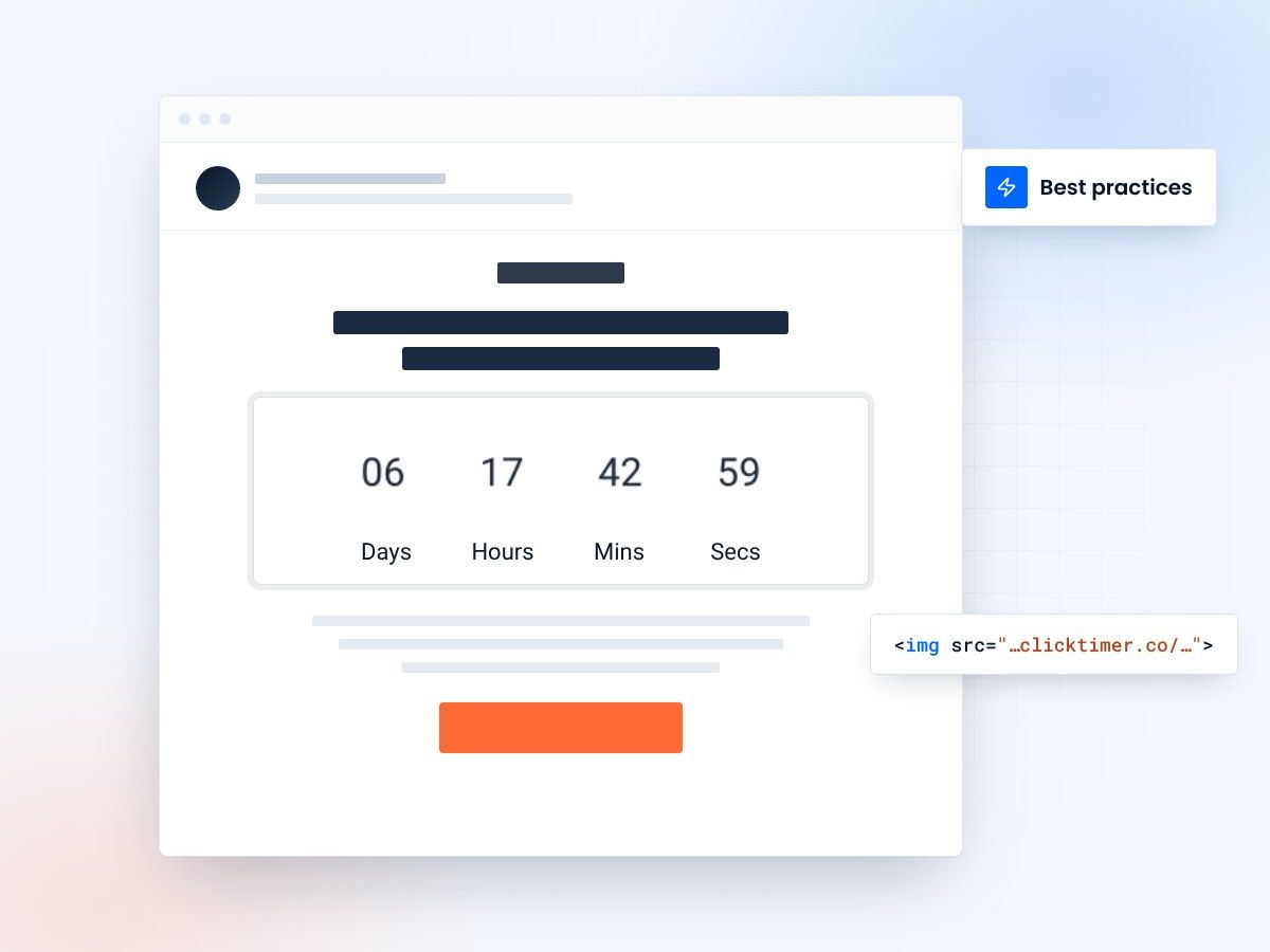
- Placement that gets seen
- Design that matches your brand
- Honest urgency only
- 10,000 free impressions a month
Why best practices matter more than you think
A countdown timer in the wrong place, with the wrong design, or used too often will actively hurt your campaigns. It'll train subscribers to ignore your urgency signals, clutter your email design, and worse — damage trust when deadlines feel fake.
The difference between a timer that lifts conversions by 25% and one that gets ignored comes down to a handful of decisions.
We've seen hundreds of email campaigns using countdown timers — both good and bad. These best practices are based on what actually works in real-world campaigns across ecommerce, SaaS, events, and more.
Where to put your timer
Timer placement is the single biggest factor in whether it drives action or gets overlooked. The data is clear: timers placed above the fold, near the primary CTA, outperform every other placement.
Best: Below the headline, above the CTA
This is the highest-converting position. The headline explains the offer, the timer creates urgency, and the CTA button converts. It's a natural reading flow: What → Why now → Take action.
Good: In the hero section as a design element
Some brands integrate the timer into their hero image or banner area. This works well for event-driven campaigns (Black Friday, product launches) where the timer IS the message.
Acceptable: Near a secondary CTA mid-email
If your email has multiple sections with different offers, placing a timer next to each relevant CTA can work. But don't overdo it — one timer per email is usually enough.
Bad: Buried at the bottom of the email
If subscribers need to scroll past 5 paragraphs, 3 product images, and a social proof section to find the timer, it won't create urgency. Most people don't scroll that far in emails — especially on mobile.
Bad: In the email footer
A timer in the footer is functionally invisible. Fewer than 10% of email recipients scroll to the footer. If your urgency message isn't above the fold, it doesn't exist.
Making your timer look professional
Match your brand identity
Your countdown timer should feel like a natural part of the email, not a foreign element pasted in. Use your brand's exact colors and fonts. With ClickTimer's 900+ Google Fonts library, there's no excuse for a timer that looks out of place. If your emails use Inter, use Inter in the timer. If your brand color is #1a73e8, use exactly that.
Size it right for mobile
Over 60% of emails are opened on mobile devices. A timer that looks great on desktop but becomes unreadable on a 375px iPhone screen is useless. Set your timer to at least 300px wide and test it on mobile before sending. Use a full-width container on mobile for maximum impact. The numbers should be large enough to read at a glance — if you need to squint, it's too small.
Contrast is non-negotiable
The timer needs to visually pop. Dark text on a light background (or white/light text on a dark background) ensures readability across all devices and lighting conditions. Avoid placing the timer over busy images, gradients, or patterns. A solid background color — even a subtle one — provides the contrast needed for instant readability.
Always label your units
The numbers "03 : 14 : 22 : 07" mean nothing without context. Always show labels: Days / Hours / Minutes / Seconds. Without labels, the subscriber has to pause and interpret the numbers — and that pause is enough to break the urgency effect. Good timer tools include unit labels by default.
Use transparent backgrounds when possible
If your email has a colored or gradient background, set the timer background to transparent so it blends seamlessly into the design. This creates a more polished, integrated look compared to a timer with a white rectangle around it on a colored email background.
When to use (and not use) timers
When timers work best
- Flash sales & limited-time offers
- Black Friday / holiday campaigns
- Early-bird pricing deadlines
- Event / webinar registration
- Product launch countdowns
- Free trial expirations
- Abandoned cart recovery
- Shipping cutoff reminders
When to skip the timer
- Regular newsletters with no deadline
- Brand awareness campaigns
- Every single email (urgency fatigue)
- Fake deadlines that reset daily
Create your best-practice countdown
Set the end date, match your brand, copy the code. 10,000 free impressions a month, no credit card.
Already have an account?
Send Test Email
Enter your email to receive a preview of how this countdown looks in email campaigns.
The most important best practice
This is the one that most marketers get wrong. If the timer hits zero, the deal should actually end. Nothing destroys subscriber trust faster than a "LAST CHANCE — 2 hours left!" email followed by the same offer being available the next day. If your urgency isn't real, don't use a timer.
Evergreen timers (where each subscriber gets a personal countdown) are fine for cart recovery and trial expirations. But make sure the experience after the timer expires is consistent — if the timer says the offer ends, redirect the expired link to a "Sorry, this offer has ended" page.
After the timer expires
Don't leave a "00:00:00" timer sitting in your email. Use an expired state feature to show a custom message like "This offer has ended" or redirect to a relevant page. ClickTimer allows you to configure what happens when the countdown reaches zero — use it.
This matters because emails live in inboxes forever. Someone might open your email days after the campaign ended. A properly handled expired state maintains professionalism and can still drive traffic to your site (e.g., "This sale is over, but check out our current offers →").
A/B testing your timers
Like everything in email marketing, you should test your countdown timer strategy. Here are the variables worth testing:
| Variable | What to test |
|---|---|
| Timer vs. no timer | Start here. Send the same email to two groups — one with a timer, one without. Measure click-through rate and conversion rate. |
| Placement | Above the fold vs. mid-email. You'll likely find above the fold wins, but your audience might surprise you. |
| Size | Full-width vs. inline. Some audiences respond better to a large, dominant timer. Others prefer a subtler approach. |
| Color scheme | High-contrast (red timer on white) vs. subtle (brand colors). Urgency colors like red and orange often outperform for sale-driven campaigns. |
| Deadline length | 24-hour countdowns vs. 48-hour vs. 7-day. Shorter deadlines generally convert better, but too short and people miss the window. |
Frequently asked questions
How often should I use countdown timers in emails?
2-4 times per month is the sweet spot. More than that and your subscribers develop urgency fatigue. Reserve timers for genuinely time-sensitive offers.
What's the ideal countdown duration?
For flash sales, 4-24 hours creates the strongest urgency. For events and launches, 3-7 days gives people enough time to plan while still feeling the deadline. For abandoned cart emails, 2-6 hours works best.
Should I use the same timer design for every campaign?
Use consistent brand fonts and colors, but vary the timer style based on the campaign type. A Black Friday timer can be bold and dramatic, while a free trial expiration timer should be subtler and more informational.
Do countdown timers affect email deliverability?
No. Countdown timers are standard images embedded via img tags. They don't affect spam scores or deliverability. However, if you use fake urgency and subscribers mark your emails as spam because of it, that will hurt deliverability indirectly.
What colors work best for countdown timers?
For urgency-driven sales, red, orange, and dark backgrounds with white text perform well. For professional/B2B emails, stick to brand colors. Always ensure high contrast between the numbers and background for readability.
Put these best practices to work
Create a professional countdown timer in about a minute. Free, no watermark, 900+ fonts.