Custom Countdown Timer Styling for Emails
Make your countdown timers look exactly like your brand — 900+ fonts, custom colors, and flexible layouts.
Create Your Timer — Free 10,000 free impressions a month · No watermark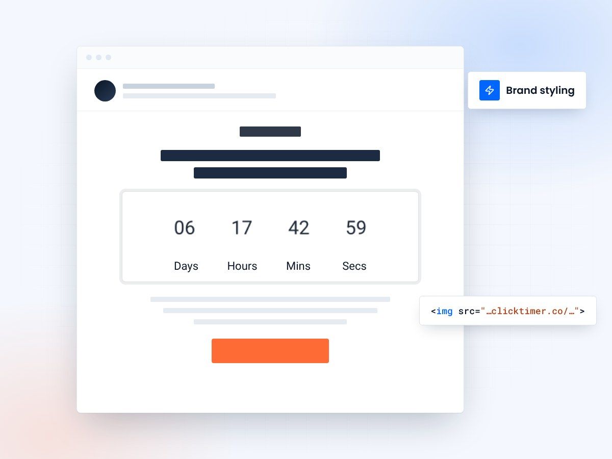
- 900+ Google Fonts
- Hex colors for every timer element
- Same render in every email client
- No watermark, even on the free plan
Why custom styling matters for email timers
A countdown timer that doesn't match your brand sticks out like a sore thumb. When recipients see a generic timer with default fonts and clashing colors, it undermines the professionalism of your entire email. Custom styling transforms a utilitarian countdown into a seamless brand element that reinforces your visual identity.
Unlike most countdown timer tools that limit you to a handful of preset themes, ClickTimer gives you full creative control. With 900+ Google Fonts, unlimited color options, adjustable sizes, and flexible layouts, you can design timers that look like they were built by your design team — because effectively, they were. You just used ClickTimer as the rendering engine.
This guide covers every styling option available, with practical examples for different brand aesthetics and use cases.
Typography: 900+ Google Fonts
Typography is the single most impactful styling choice for your countdown timer. ClickTimer supports the entire Google Fonts library — over 900 font families — so you can match your brand's exact typeface.
Luxury brands
For luxury brands, consider elegant serifs like Playfair Display or Cormorant Garamond.
Tech companies
Tech companies often gravitate toward clean sans-serifs like Inter, Space Grotesk, or JetBrains Mono for a developer-friendly look.
E-commerce brands
E-commerce brands typically choose high-readability fonts like Poppins, Nunito, or Montserrat that pop in busy inboxes.
Color customization options
ClickTimer offers granular color control across multiple timer elements. You can independently set the color of the digit numbers, the label text (Days, Hours, Minutes, Seconds), the background, and separator elements.
| Element | What It Controls | Best Practice |
|---|---|---|
| Digit Color | The countdown numbers themselves | Use your primary brand color or high-contrast dark |
| Label Color | "Days", "Hours", "Minutes", "Seconds" text | Use a muted version of your digit color |
| Background Color | Timer background area | Match your email background or use transparent |
| Separator Color | Colons or dividers between time units | Same as digit color, or lighter for subtlety |
All colors accept standard hex values, giving you pixel-perfect control over your brand palette. For dark email templates, use light digit colors with transparent backgrounds. For light templates, bold primary colors on white or transparent backgrounds work best.
Size and layout configuration
Timer dimensions matter more than most people realize. Too small and the countdown loses its impact — too large and it dominates the email, pushing important content below the fold. The sweet spot depends on your email layout and where the timer sits in your content hierarchy.
Hero timers
For hero-section timers that serve as the email's focal point, wider formats (600-700px) with larger digit sizes work best.
Inline timers
For inline timers embedded within body copy, narrower formats (300-400px) with proportionally smaller text keep the flow natural.
Mobile campaigns
For mobile-optimized campaigns, keep timer width under 350px to ensure it renders well on small screens without horizontal scrolling.
Create your branded countdown
Pick your font, colors and size, then copy the code. 10,000 free impressions a month, no watermark.
Already have an account?
Send Test Email
Enter your email to receive a preview of how this countdown looks in email campaigns.
Styling checklist for brand consistency
Before you publish your timer, run through this quick checklist:
- Font match: Is the timer font the same family (or complementary) as your email headline font?
- Color harmony: Do digit and label colors align with your brand palette?
- Background blend: Does the timer background match or complement the email background?
- Size proportion: Is the timer sized appropriately for its position in the email layout?
- Mobile preview: Have you checked how the timer looks on a 375px-wide mobile screen?
- Dark mode: If your audience uses dark mode, have you tested with inverted colors?
Styling by industry
Different industries have distinct visual languages. A timer for a luxury fashion brand should feel completely different from one used by a SaaS startup or an event registration page.
E-commerce and retail
For e-commerce and retail, bold sans-serif fonts with urgency-inducing red or orange digit colors drive action.
B2B and SaaS
For B2B and SaaS, clean modern typefaces with blue or dark gray tones convey professionalism.
Events and entertainment
For events and entertainment, playful fonts with vibrant colors create excitement.
Healthcare and finance
For healthcare and financial services, conservative serif fonts with navy or forest green instill trust.
A/B testing your timer design
Don't just pick a style and forget it. Your timer design is a conversion variable worth testing. Create two or three variations with different font choices, color schemes, or sizes, and split-test them against your KPIs.
Common A/B tests that move the needle: red digits vs. brand-color digits (urgency vs. consistency), large hero timer vs. smaller inline timer (prominence vs. subtlety), and serif vs. sans-serif fonts (traditional vs. modern). Because ClickTimer is pay-as-you-go with no subscription, running multiple timer variations costs nothing extra beyond the impressions — making it the most affordable platform for this kind of experimentation.
Frequently asked questions
Can I use my own custom font that isn't on Google Fonts?
ClickTimer supports the full Google Fonts library (900+ fonts). If your brand font is a commercial typeface not on Google Fonts, choose the closest visual match from the library.
Does the free tier include full styling options?
Yes. All styling options — fonts, colors, sizes — are available on the free tier (up to 10,000 impressions). There's no watermark and no feature restrictions.
How do I handle transparent backgrounds?
Set the background color to transparent in the ClickTimer configurator. The GIF will render with a transparent background, blending seamlessly into any email design.
Will my styled timer look the same across all email clients?
Yes. Because ClickTimer renders the timer as a GIF image server-side, what you see in the configurator is exactly what every recipient sees — regardless of their email client.
Can I save timer style presets for reuse?
You can bookmark or save the configurator URL with your styling parameters to quickly recreate the same look for future campaigns.
Style your first countdown today
Match your fonts and colors in about a minute, then paste the timer into any email platform that accepts an image.